Machine Learning은 크게 3가지로 분류할 수 있다.
- Supervised Learning
- Unsupervised Learning
- Semi-supervised Learning
이중 Unsupervised Learning 방식인 Clustering에 대한 복습을 진행한다.
Clustering은 Target값이 주어지지 않은 데이터를 위한 알고리즘으로, 유사한 객체들을 그룹화해가는 작업이다.
그룹화 방식에 따라 K-means, DBSCAN, Mean-Shift 등으로 나뉜다.
# 데이터 전처리
고객의 정보 데이터(ID, 나이, 성별, 소득, 지출 점수)를 이용하여 Clustering을 진행한다.
df = pd.read_csv("C:/Users/jain5/Desktop/Euron/Data_Handling/Mall_Customers.csv")
df.rename(index=str, columns={'Annual Income (k$)': 'Income',
                              'Spending Score (1-100)': 'Score'}, inplace=True)
df.head()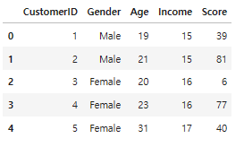
# Let's see our data in a detailed way with pairplot
X = df.drop(['CustomerID', 'Gender'], axis=1)
sns.pairplot(df.drop('CustomerID', axis=1), hue='Gender', aspect=1.5)
plt.show()
데이터를 자세하게 분석한 결과, 성별과 고객 ID는 고객의 세분화와 큰 연관이 없음을 알 수 있다.
따라서 두 column은 drop 후 학습을 진행한다.
# K-Means
K-Means는 단순하지만 여러 데이터 과학 프로그램에서 사용되는 클러스터링 방법이다.
특히 레이블이 지정되지 않은 경우 빠르게 레이블을 판단해야하는 경우에 사용한다.
K-Means의 경우 군집의 수(K)를 정하기 위한 방법으로 Elbow Method와 Silhouette score 등이 있다.
Elbow Method란 군집 수에 따라 군집내 제곱합(WSS)를 그래프로 나타내 감소율이 크게 낮아지는 지점(팔꿈치와 같이 크게 꺽이는 지점이므로 Elbow Point라 한다.)을 K로 선택하는 방식이다.
from sklearn.cluster import KMeans

clusters = []

for i in range(1, 11):
    km = KMeans(n_clusters=i).fit(X)
    clusters.append(km.inertia_)

fig, ax = plt.subplots(figsize=(12, 8))
sns.lineplot(x=list(range(1, 11)), y=clusters, ax=ax)
ax.set_title('Searching for Elbow')
ax.set_xlabel('Clusters')
ax.set_ylabel('Inertia')

# Annotate arrow
ax.annotate('Possible Elbow Point', xy=(3, 140000), xytext=(3, 50000), xycoords='data',
             arrowprops=dict(arrowstyle='->', connectionstyle='arc3', color='blue', lw=2))

ax.annotate('Possible Elbow Point', xy=(5, 80000), xytext=(5, 150000), xycoords='data',
             arrowprops=dict(arrowstyle='->', connectionstyle='arc3', color='blue', lw=2))

plt.show()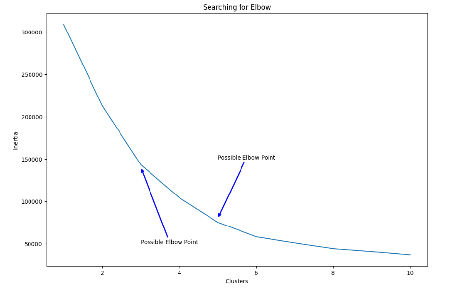
K= 3과 5를 최적 군집수로 선택할 수 있다.
먼저 K=3과 5일때 각각 K-Means 알고리즘을 학습시킨다.
# 3 cluster
km3 = KMeans(n_clusters=3).fit(X)

X['Labels'] = km3.labels_
plt.figure(figsize=(12, 8))
sns.scatterplot(x=X['Income'], y=X['Score'], hue=X['Labels'],
                palette=sns.color_palette('hls', 3))
plt.title('KMeans with 3 Clusters')
plt.show()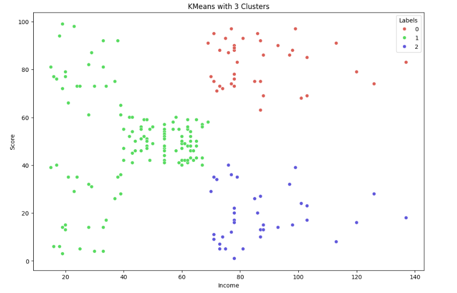
(코드 생략)
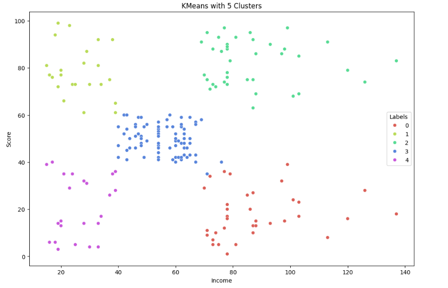
시각화 결과 K=5로 군집화 한 결과가 더 좋은 성능을 보임을 알 수 있다.
또한 분석 결과 각 5개의 클러스터링 원인을 알 수 있다.
- Label 0 is low income and low spending
- Label 1 is high income and high spending
- Label 2 is mid income and mid spending
- Label 3 is high income and low spending
- Label 4 is low income and high spending
이를 swarmplot으로 표현하면 다음과 같다.
fig = plt.figure(figsize=(20,8))
ax = fig.add_subplot(121)
sns.swarmplot(x='Labels', y='Income', data=X, ax=ax)
ax.set_title('Labels According to Annual Income')

ax = fig.add_subplot(122)
sns.swarmplot(x='Labels', y='Score', data=X, ax=ax)
ax.set_title('Labels According to Scoring History')

plt.show()
# Hierarchical Clustering
이전 K-Means는 하나의 데이터세트를 군집수에 따라 분할하는 방식이면, 이번 Clustering 방식은 작게 나뉜 데이터 군집을 응집해가며 키우는 방식이다.
이 Agglomerative Hierarchical Clustering은 더욱 대중적인 상향식 접근 방식이다.
또한 응집 클러스터링은 생성할 군집 수(n_clusters)뿐만 아니라 데이터 관측 거리의 기준을 정하는 linkage 값을 필요로 한다.
이번 분석에서는 complete(완전) 방식이나 일반적으로 average(평균) 방식이 좋다.
from sklearn.cluster import AgglomerativeClustering

agglom = AgglomerativeClustering(n_clusters=5, linkage='average').fit(X)

X['Labels'] = agglom.labels_
plt.figure(figsize=(12, 8))
sns.scatterplot(X['Income'], X['Score'], hue=X['Labels'],
                palette=sns.color_palette('hls', 5))
plt.title('Agglomerative with 5 Clusters')
plt.show()
또한 거리를 구하는 방법을 정할 수 있다.
대표적으로 euclidean, manhattan, minkowski, cosin 이 있으나 이번 분석에서는 간단하게 distance_matrix를 이용하였다.
from scipy.cluster import hierarchy
from scipy.spatial import distance_matrix

dist = distance_matrix(X, X)

Z = hierarchy.linkage(dist, 'complete')

plt.figure(figsize=(18, 50))
dendro = hierarchy.dendrogram(Z, leaf_rotation=0, leaf_font_size=12, orientation='right')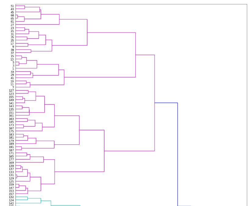
이런 계층적 군집화 방식은 dendogram을 이용하면 편리하게 시각화가 가능하다.
# DBSCAN
다음은 밀도 기반 군집화 방식인 DBSCAN이다.
밀도 기반 군집화 방식은 데이터 세트의 형태가 기하학적으로 복잡한 경우, 약간의 감독 아래에 사용하기 좋은 방식이다.
DBSCAN의 파라미터로는 Epsilon(구간의 반지름), Minimum Points(군집을 정의하기 위한 최소한의 데이터 수)이 있다.
from sklearn.cluster import DBSCAN

db = DBSCAN(eps=11, min_samples=6).fit(X)

X['Labels'] = db.labels_
plt.figure(figsize=(12, 8))
sns.scatterplot(X['Income'], X['Score'], hue=X['Labels'],
                palette=sns.color_palette('hls', np.unique(db.labels_).shape[0]))
plt.title('DBSCAN with epsilon 11, min samples 6')
plt.show()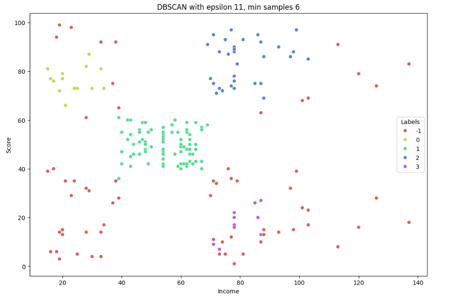
DBSCAN은 이상치를 매우 잘 감지한다는 장점이 있는데 적절한 데이터 전처리를 하지 않아줘서 그런가 많은 수의 이상치가 나왔다.
# MeanShift
K-Means와 유사하게 중심을 군집의 중심을 기준으로 군집화를 수행한다.
다만 K-Means는 거리를 이용하는 반면 MeanShift는 중심을 데이터가 모여있는 밀도가 가장 높은 곳으로 이동시킨다.
일반적으로 밀도를 구하기 위해 확률 밀도 함수(KDE)를 이용하는데, 이 KDE의 모양을 정하는 bandwidth값이 주요 파라미터이다.
파라미터값이 클수록 과적합 위험이 있다.
from sklearn.cluster import MeanShift, estimate_bandwidth

# The following bandwidth can be automatically detected using
bandwidth = estimate_bandwidth(X, quantile=0.1)
ms = MeanShift(bandwidth=bandwidth).fit(X) # 그냥 bandwidth 안됨! __init__() takes 1 positional argument but 2 were given

X['Labels'] = ms.labels_
plt.figure(figsize=(12, 8))
sns.scatterplot(x=X['Income'], y=X['Score'], hue=X['Labels'],
                palette=sns.color_palette('hls', np.unique(ms.labels_).shape[0]))
plt.plot()
plt.title('MeanShift')
plt.show()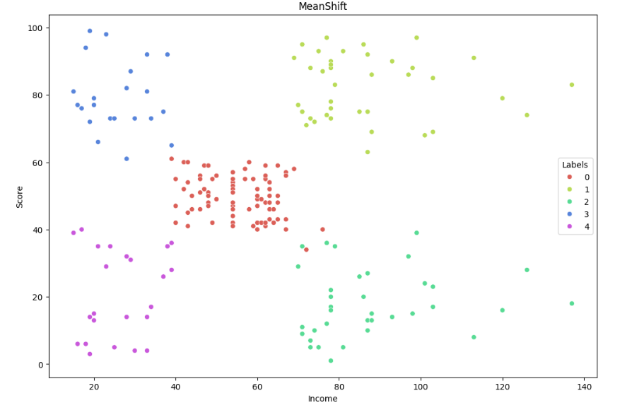
sklearn에서 제공하는 estimate_bandwidth() 를 이용해 최적의 bandwidth를 쉽게 얻을 수 있다.
# 최종 정리
fig = plt.figure(figsize=(20,15))

##### KMeans #####
ax = fig.add_subplot(221)

km5 = KMeans(n_clusters=5).fit(X)
X['Labels'] = km5.labels_
sns.scatterplot(x=X['Income'], y=X['Score'], hue=X['Labels'], style=X['Labels'],
                palette=sns.color_palette('hls', 5), s=60, ax=ax)
ax.set_title('KMeans with 5 Clusters')


##### Agglomerative Clustering #####
ax = fig.add_subplot(222)

agglom = AgglomerativeClustering(n_clusters=5, linkage='average').fit(X)
X['Labels'] = agglom.labels_
sns.scatterplot(x=X['Income'], y=X['Score'], hue=X['Labels'], style=X['Labels'],
                palette=sns.color_palette('hls', 5), s=60, ax=ax)
ax.set_title('Agglomerative with 5 Clusters')


##### DBSCAN #####
ax = fig.add_subplot(223)

db = DBSCAN(eps=11, min_samples=6).fit(X)
X['Labels'] = db.labels_
sns.scatterplot(x=X['Income'], y=X['Score'], hue=X['Labels'], style=X['Labels'], s=60,
                palette=sns.color_palette('hls', np.unique(db.labels_).shape[0]), ax=ax)
ax.set_title('DBSCAN with epsilon 11, min samples 6')


##### MEAN SHIFT #####
ax = fig.add_subplot(224)

bandwidth = estimate_bandwidth(X, quantile=0.1)
ms = MeanShift(bandwidth=bandwidth).fit(X)
X['Labels'] = ms.labels_
sns.scatterplot(x=X['Income'], y=X['Score'], hue=X['Labels'], style=X['Labels'], s=60,
                palette=sns.color_palette('hls', np.unique(ms.labels_).shape[0]), ax=ax)
ax.set_title('MeanShift')

plt.tight_layout()
plt.show()
데이터 세트의 형태가 복잡하지 않아 DBSCAN을 제외한 나머지 Clustering 방식에서는 적절하게 잘 군집화가 진행된 것 같다.
# 참고 사이트
https://www.kaggle.com/code/fazilbtopal/popular-unsupervised-clustering-algorithms
Popular Unsupervised Clustering Algorithms
Explore and run machine learning code with Kaggle Notebooks | Using data from Mall Customer Segmentation Data
www.kaggle.com
'Euron > 정리' 카테고리의 다른 글
| [Week16] 08. 텍스트 분석 - 실습(2) (0) | 2023.12.29 |
|---|---|
| [Week16] 08. 텍스트 분석 - 실습 (2) | 2023.12.22 |
| [Week15] 08. 텍스트 분석 (1) | 2023.12.18 |
| [Week12] 07. 군집화 실습 - 고객 세그먼테이션 (0) | 2023.11.22 |
| [Week11] 07. 군집화(2) (0) | 2023.11.15 |


